How To Design Awesome Pocket Tees That Everyone Will Love And Talk About
estimated reading time 15 minutes (2 minute skim)
Looking to create pocket tees for your clothing line or brand? Great choice.
Pocket tees are a stylistic t shirt design option with an emphasis on the cut and sew construction of the pocket. This article contains tips to design and create artwork for pocket tees that we have compiled over tens of thousands of designs and hundreds of thousands of pocket tees.
While artwork guidelines for pocket tees are forgiving and it is easy to achieve good results, these design tips will help to ensure you will get a great result. The suggestions in this article will give you ideas to get started on a design, improve an existing design, and solve common branding challenges with pocket tees.
There are many resources to design artwork for t shirts, none of them address specific challenges and opportunities with creating artwork for pocket tees, which this article does.
This article is written in a way that it should make sense to everyone, even if you aren’t a graphic artist or if this is your first time creating artwork for pocket tees. Additionally, even if you are an experienced graphic artist with a honed set of talents this article can provide some subtle pointers that are specific to pocket tee artwork and will help you quickly achieve amazing results. Some aspects of pocket tee artwork simply aren’t obvious, but are easily understood once explained. However, before you get started, it’s recommended to understand artwork requirements for pocket tees, these more technical details create a foundation of knowledge to build from.
By the end of this article you will be better at creating artwork for pocket tees, so let’s get started!
Find any easy shortcut to what you are looking for
Use this table of contents to quickly jump around
- Overview: Design Tips For Pocket Tees
- All over artwork always gets better results, find out why.
- Look more Pro with this simple tip
- Discover the art of selecting a great background color for your pocket
- Make sure to avoid this common mistake
- Get better looking pocket tees right here
- How To Create A Simple Pattern From Text, Images, or Logos
- How You Can Charge More For Your Pocket Tees
- Put Pattern To Work For Your Brand Image
- Don’t forget about scale in your patterns
- Here are some other background ideas that tend to improve designs
- 2 winning ideas to combine your logo and your pattern
- How to make your sure your logo and text looks really good
- A special note about white text
- The absolute best way to get your logo on your pocket tees
- Do Not Overlook Cropping
- Make People Love Your Shirts Now And Forever
All over artwork almost always gets better results, find out why.
This simple rule is so fundamental it is the first rule. It’s also one of the most common mistakes and one of the easiest mistakes to correct when creating artwork for pocket tees.
Design Tip: Don’t leave open space (transparency) or white space in your artwork for your pocket.
Understanding the production process can help you understand why this is a problem. The printing and production process we have developed to create pocket tees first prints your design on a flat piece of white fabric, which is then folded and ironed into a pocket then sewn onto your t shirt. This process enables artwork to extend to the end of the pocket and wrap around the edge of the pocket where it is folded and sewn onto the shirt. Essentially, your canvas is the entire pocket and it’s best if you use the entire canvas.

This means that if there are areas of your artwork where there is no artwork (transparency) a plain white fabric will show on the pocket. This doesn’t create the best aesthetic.
Look more Pro with this simple tip
A common mistake beginners make is to have a piece of artwork surrounded by whitespace or transparency. While this type of composition can look good when printing directly onto a t shirt it isn’t recommended when designing artwork for a pocket. The pocket creates a frame for your artwork and any empty space around your artwork within the frame won’t look great.
Correcting this mistake is simple. Adding a background color to your artwork will immediately make your design look more professional and help to create a mood to the design.
A similar to concept exists in canvas painting;
“The first technique I always teach in painting (and a technique I use on 99% of my work) is to cover the white canvas with one solid paint colour which is called a ‘ toned ground’.”
-Will Kemp, Award Winning Professional Artist & Teacher
So the next task is…
Discover the art of selecting a great background color for your pocket

When selecting a background color, think about the mood you are trying to create with the design. While a pastel color is great to accentuate a softer design a bold background can help achieve a punch in harder hitting design.
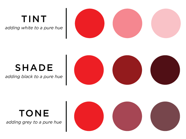
If you have a simple logo (like for a business) that you want to use on your pocket and you are looking for a good background color, identify a primary or secondary color used in the artwork and use a tint, shade, or tone of that color as a background.
Tints, shades, and tones are simply a fancy way of creating similar colors by adding white, black, or gray to your color. This technique can create a background that “goes with” your logo and creates an eye pleasing design quickly. Just make sure there is enough contrast between your logo and the background so the logo remains visible.
Make sure to avoid this common mistake
A word of caution, don’t try to match the background color of your artwork to the shirt. It will never match exactly because most t shirts are pigment dyed while your pocket artwork will be printed with water based inks. It is best to use a background color that is intentionally different from the color of the shirt you will use.
When used properly all over artwork creates a visible contrast between your pocket artwork and the t shirt, much the way a canvas is immediately visible when hung on a wall.
Get better looking pocket tees right here
You already know that having an all over print is a powerful and simple design aesthetic for pocket tees and you now have a few techniques to add backgrounds to your artwork.
However, just having an all over print doesn’t guarantee a great result alone. It’s also important for your pocket artwork to have good composition, like any piece of artwork. Composition is basically the way the different elements within your artwork interact with each other.
“The point of a composition is to pull the eye of the viewer across the painting, taking in individual elements to finally focus on the main feature or focus of the painting.”
-Mark Mitchel Artwork Dealer

A common beginner mistake is to simply place a piece of artwork in the dead center of the pocket. We’ve learned to improve that design by adding a background color to it, but we can further improve the design by altering how the logo is placed within the pocket and what other design elements surround the artwork.
Using graphic design software it is incredibly simple to take an image, graphic, or text and repeat it to create a pattern. The most basic form doing this is to “tile” a single image again and again in order to create a pattern.
How To Create A Simple Pattern From Text, Images, or Logos

One method to improve composition is a step and repeat pattern. A step and repeat pattern is a method of repeating a single or multiple images to create a visually appealing pattern. The step and repeat pattern typically uses an offset grid so that images within the pattern repeat in a visually pleasing way. What words can you use to tell your brand story?
It’s simple to do in photoshop, illustrator, and gimp as long as you are familiar with how those programs work, as well as many other design programs.
How You Can Charge More For Your Pocket Tees
Design Tip: Your repeating patterns should extend all the way off the pocket and should not stop before the end of the pocket.

Selecting a premium t shirt like Bella Canvas is an absolute necessity to selling higher price point products, but that isn't the only thing you can do.
Adding elegant and simple design elements to your pattern creates a luxury aesthetic. For example, repeating your logo or part of your logo can create a visually appealing pattern when done well.
In fact, this approach is common practice for top tier luxury brands like fendi, gucci, and coach, which simply use a repeating letter with very minimal design embellishments to create visually pleasing patterns.
Design tip: Luxury designs tend to bring about elegance through simplicity, while “fun” design tend to have more variety in their pattern.
Put Pattern To Work For Your Brand Image
To take your pattern to the next level, you can use a set of icons that are brand visuals to construct into a repeating pattern to create a beautifully intricate or playful design.

In selecting brand visuals to use for a repeating pattern it’s best to choose icons or images that resonate for your brand. If your brand foundation is the love of off road motorsports a puff of exhaust smoke, a glob of mud, an off road tire, and helmet could be appropriate images to incorporate, where as if your brand is about techy stuff an old school nintendo controller, a sprocket, and a laser beam may be more appropriate brand visuals to use in a repeating pattern. Either way, surrounding your brand with things that your brand stands for and your audience loves is a great way to make pocket artwork more fun and appealing.
Don’t forget about scale in your patterns
When you are creating repeating patterns you can increase the size of certain elements within the pattern. This draws attention to certain elements within the design and creates emphasis on specific items within the design. It can also make the design more visually appealing.
Here are some other background ideas that tend to improve designs
If you aren’t very design savvy, don’t feel like you have to create a step and repeat pattern from scratch in order to use a beautiful background as part of your pocket. In fact, there are plenty of other options that are completely suitable for background images.

For example, you could use a sky with little clouds as part of the background for your pocket. Or you could use a texture like bark from a tree or sand from the beach as a background. Finally, a colorful floral print could be the background contrast you need to make your travel inspired brand pop. You can even use a photograph as a background image. Any of these design elements can set an appropriate tone for your artwork and help bring it to life.
Ok so you want to find a great background, where to start?
The good news is there are a ton of cost effective design resources that you can purchase to use as repeating backgrounds. We recommend checking our Freepik and Vecteezy for a few bucks you can grab a great background for your artwork and license it to create and sell your products. You can also checkout Unsplash for an amazing selection of photographs that you can use completely free.
2 winning ideas to combine your logo and your pattern
Ok so you have your logo and you have your pattern, now what? You gotta put these together and make them look good!
We’ve already discussed how you can use your logo within the step and repeat pattern and perhaps give it some prominent in size or contrast so it is the most visible design element in the pattern. Remember, composition wants the eye to wander, but ultimately settle on the feature of the artwork (likely your logo).
You can also break the repeating pattern by placing your logo “on top” of the pattern. There are a couple ways of doing this.
- you can create an empty shape (square or circle work well) of background color around your logo in the center of the pocket. Breaking a repeating pattern or photograph tastefully isolates your logo and creates it as the center of attention, but still surrounds it with fun and appealing images.
- you can place your logo right on top of the repeating pattern without any space allowance. If you do this it is recommended to add a stroke to your logo to visually separate the logo from the pattern to make your logo more visible.
How to make your sure your logo and text looks really good
When creating pocket tees you definitely want your logo to to look good, it’s a no brainer. There are a few things you can do to ensure your logo looks really good.
First and foremost, you logo won’t look good if people can’t see it well. Ensure that there is adequate contrast (difference in color) between your logo and your background color. Remember not every color you see on your computer screen can be printed or appear as vibrant as your screen.
Another aspect to making your logo (or any text) visible is the line thickness and weight of the font. Fonts that are extremely narrow or thin will not appear as visible as fonts that are thicker. The same goes for logos that have extremely fine lines or details.
Design tip: Avoid narrow and thin fonts. Use bold versions of thinner fonts or add stroke to the font.
A special note about white text
Since all pockets are printed on white fabric, no white ink is used in the printing of pockets. If you have white in your file that area will not have any ink printed. Extra care must be taken when using white text. Ensure white text is large enough and has enough contrast for it to be seen in your design. If it’s somewhat difficult to see your white font in your design, it will not show up well when printed. Consider printing your text in a color or adding a color stroke to the outside of white fonts to ensure they are visible.
The absolute best way to get your logo on your pocket tees
While adding your logo to a pattern or on top of a pattern is a tasteful way of doing things, there is still a better way to add your logo to your pocket tees.
Design Tip: We believe the highest quality way to add logos to pocket tees is with a pocket flag woven label.
Using a woven label accomplishes many design objectives;

- It allows your pocket artwork to be just that; artwork. You don’t need to find a way to force your logo into your artwork. Let the art speak for itself.
- The flag is a double whammy because they are 2 sided. You can have your logo on the front and your brand name on the back (or other artwork).
- The flag hangs off the pocket so is highly visible and easily noticed when the pocket tee is worn.
- It demonstrates that the design was well thought out and constructed in a quality manner.
In fact, in a previous lifetime Apliiq was a fashion brand and all of the pocket tees we manufactured used a pocket flag for branding to carry the Apliiq brand mark. The only notable downsides to using pocket flag woven labels is a slight increase in costs ($100 per year) and a slightly extended timeframe (3-4 weeks to manufacture woven labels). If you budget and timeframe can support it, woven labels are a must do!
As you can see there are a bunch of design considerations with pocket tees, however, there is one more important design consideration.
Do Not Overlook Cropping
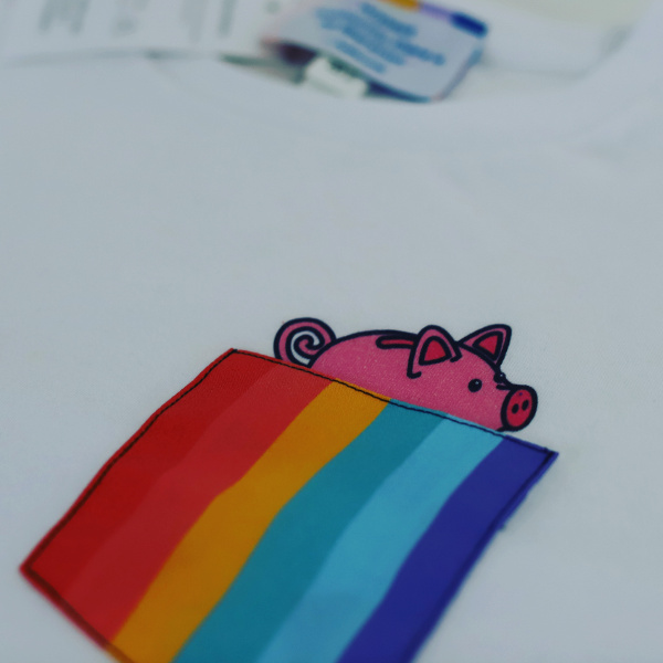
The pocket also creates another distinct design opportunity; controlling how your artwork is cropped within the pocket or by the pocket. The opportunity becomes especially pronounced when using artwork that is not a repeating pattern, for example a picture or a single graphic image. You can intentionally cut off parts of the image to draw people’s attention in certain ways.
Make People Love Your Shirts Now And Forever
By now these tips probably have you thinking about how to design some awesome pocket tees for your brand and that is a great start. But remember, pocket tees are a relatively new type of custom t shirt, so we are still learning everyday. We are constantly amazed with the design that customers come up with and are still discovering some things we need to be careful about as designers. We will update this article as we learn more about creating pocket tees, so stay tuned for updates.