How To Get The Colors You Want For Pocket Tees
While pocket tees have the advantage of creating photo-realistic images there are some limitations with regards to colors and steps you can take to ensure you get a print you will love.
Disclaimer: It is your responsibility to manage the colors in your artwork. We will not refund or reprint orders that do not match the colors you see on your monitor.
Understanding Differences In How Colors Are Constructed And Displayed
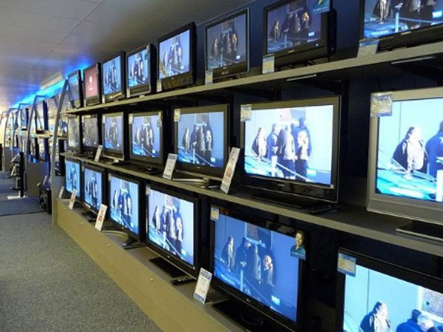
Take a moment to consider the nature of the problem. Every device (computer, phone, television) will display colors differently. Just look at the same picture on a bunch of TVs and you will quickly notice each TV displays the same picture differently.
Not Every Color You See On Your Monitor Is Available In Pocket Printing
Furthermore, the colors these devices use (RGB) is different from how colors are printed (CMYK). This is true for all digital printers including sublimation printing, which is used to create pockets. The CMYK color space does not contain all colors that exist in RGB, so not all colors can be translated directly.

As you can see not all RGB colors are achievable in sublimation printing. Also, colors don't translate exactly how you'd expect. Some (not all) of the most tricky colors are:
- The brightest blues may be printed a much deeper blue.
- Some blues look purple
- Some reds look orange
- The brightest pinks may be printed in a more muted pink.
- The brightest greens may be printed in a more muted green.
Changes in colors are most perceptable when you have created graphics that utilized a few of colors that don't translate well. For example, a highlighter pink background. On the other hand, a photograph uses so many colors the color shifts are less perceptable.
Colors to be mindful of
As you can see, many of the brightest RGB colors don't translate well to sublimation printing. If you are very sensitive to color accuracy and you are only using a limited color set in your artwork, we recommend that you understand how those colors translate into the CMYK colorspace.
Get A Digital Preview
If you have solid graphic design skills, you can convert your artwork into the CMYK color space to see what it looks like before ordering. This can be done using graphic design software like Adobe Photoshop or Gimp (this is completely free design tool). If you don't have strong graphic design skills, you can also use this website to convert your images from RGB to CMYK. Seeing your artwork in the CMYK colorspace is an easy check to see how much the colors of your design may change. However, since you are still viewing the colors via and RGB device, they still may not be perfect.
Order A Sample Before You Go Big
The great thing about pocket tees are that they are affordable to get just one item and there are no minimums. Getting your artwork turned into a pocket tee is the absolute best way to ensure you artwork will look like you want it to. It can also alert you to specific colors so you can update them in your file to try to correct them before ordering a large quantity.
Plan Your Artwork With Colors In Mind
If you are planning to turn your artwork into a pocket, plan out your use of colors beforehand. Select a color palette that you know will transfer from RGB to CMYK with little variation.
Invest in Color Matching Tools
There are reliable tools that will help you match and choose colors for your artwork and provide very predictable results. You can purchase a color bridge guide as a reference tool.
Don't Be Worried
If you are turning a photograph into a pocket tee, there is probably little perceivable variation between your file and what the pocket tee will look like. Also, when color shift happens it doesn't necessarily look bad it just looks different.
